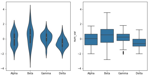
![]() Comparing the two plots the box plot is a cleaner summary of the data than the violin plot it’s easier to compare statistics between the groups with a box plot this makes a box plot worth more consideration if you have a lot of groups to compare or if you are building explanatory plots you can clearly see from the box plot that the Delta group has the lowest median on the other hand the box plot lacks as nuanced a depiction of distributions as the violin plot you can’t see the slight bimodality present in the Alpha level values the violin plot may be a better option for exploration especially since seaborn’s implementation also includes the box plot by default
Comparing the two plots the box plot is a cleaner summary of the data than the violin plot it’s easier to compare statistics between the groups with a box plot this makes a box plot worth more consideration if you have a lot of groups to compare or if you are building explanatory plots you can clearly see from the box plot that the Delta group has the lowest median on the other hand the box plot lacks as nuanced a depiction of distributions as the violin plot you can’t see the slight bimodality present in the Alpha level values the violin plot may be a better option for exploration especially since seaborn’s implementation also includes the box plot by default