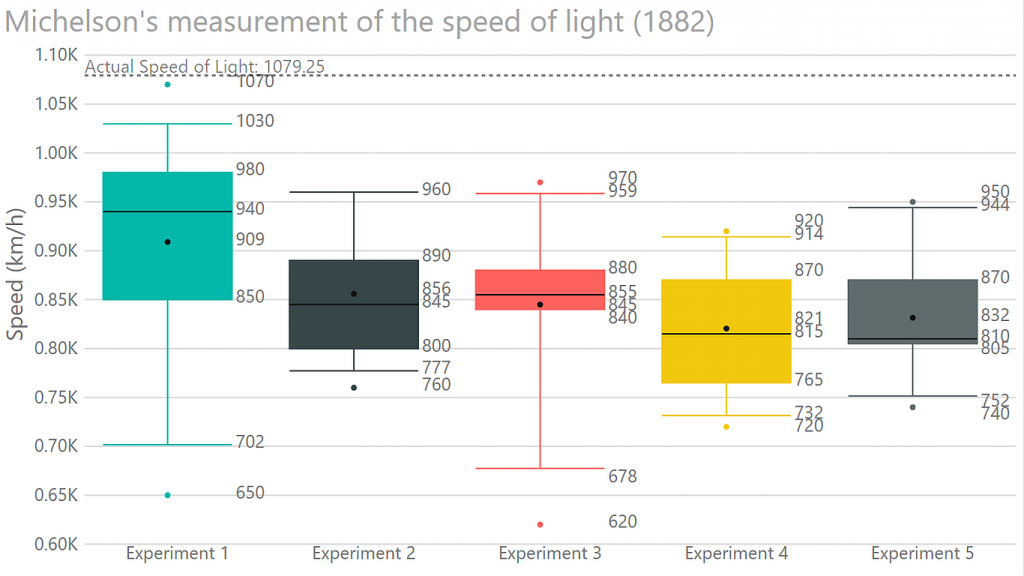
![]() Microsoft Power BI ‚Box and Whisker plot chart‘ – is a convenient way of graphically depicting groups of numerical data through their quartiles
Microsoft Power BI ‚Box and Whisker plot chart‘ – is a convenient way of graphically depicting groups of numerical data through their quartiles
![]() Microsoft Power BI ‚Box and Whisker plot chart‘ – is a convenient way of graphically depicting groups of numerical data through their quartiles
Microsoft Power BI ‚Box and Whisker plot chart‘ – is a convenient way of graphically depicting groups of numerical data through their quartiles