![]() Microsoft Power BI ‚Radar Chart‘ – is a graphical method of displaying multivariate data in the form of a two-dimensional chart of three or more quantitative variables represented on axes starting from the same Point
Microsoft Power BI ‚Radar Chart‘ – is a graphical method of displaying multivariate data in the form of a two-dimensional chart of three or more quantitative variables represented on axes starting from the same Point
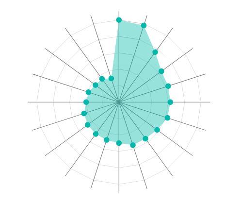
Posted in Administration, Power BI | No Comments »
![]() Microsoft Power BI – custom visuals gallery
Microsoft Power BI – custom visuals gallery
Posted in Administration, Power BI | No Comments »

Posted in Administration, Healthcare Info | No Comments »
Posted in Administration | No Comments »
IT Solutions Technology Blog is proudly powered by WordPress
Entries (RSS) and Comments (RSS).